

I bought this one recently on what was basically pure cover appeal. I mean, don't get me wrong, J. Anderson Coats' The Wicked and the Just sounds pretty damn awesome, but I am a sucker for silhouettes, awesome fonts, and watercolory sunsets - it was pretty much guaranteed to end up on my bookshelves... So imagine my surprise when I came across the newly released cover the other day. Now, I have to say, I do like the font on the new cover as well, and the patterned background is nice. But the two have such totally different feels to them (and not having read it, I don't know which is more accurate), that I was surprised they were for the same book! So take a look, use the synopsis to help make your decision, if you're so inclined, and then tell us in the comments,
Which one did it better?
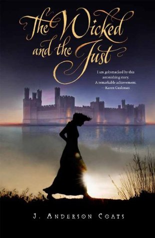

This powerful historical fiction debut, set in medieval Wales, follows Cecily whose family is lured by cheap land and the duty of all Englishman to help keep down the “vicious” Welshmen, and Gwenhwyfar, a Welsh girl who must wait hand and foot on her new English mistress. As issues of prejudice, heritage, and occupation come to a head, both girls have to find a way to survive.
 Last week on FFO: The original and redesigned covers for Gennifer Albin's Crewel World series went head to head (with the biggest shocker being that there was a head. A lot of us had somehow missed that detail on the original cover...). Though you guys were largely ambivalent about both cover designs, frankly, you were more drawn to the pretty swirls of the original.
Winner ----------->
I loved this book! And I absolutely hate the new cover. It doesn't give a sense of the setting or historical aspects (ahem - castle in Wales) at all, which is what drew me to the book in the first place. It makes me sad the original cover set it apart and now I feel like the new version is pretty bland in comparison. Though I do love the font.
ReplyDeleteSeconded! Love the first cover, not so much the second. But overall, I just love the book.
DeleteI'm not crazy about either cover, but I guess I prefer the old cover. The new one seems quite unoriginal.
ReplyDeleteI like the first cover best, although I've never read it. The fonts are both interesting, but anytime there's a 'face off' pose between two females I feel like the author is going to pit me against one of them, like I have to pick a favorite (and usually, the one I like is the one that ends up demonized by the author). Plus, if this is historical fiction, the blonde's hair should not be loose like that. Gah!
ReplyDeleteThe first one evokes a mystery to me, which might not be accurate to the story but is compelling to me eye. And more....sweeping.
I'd choose the original cover. And now I'm curious about your review (as, so far, your taste in books is impeccable- I keep picking up ones that you enjoyed, and LOVING them). Is it good? Should I put it on my TBR pile?? Don't keep me in suspense! ;)
I like both of them, but I'm going to have to go with the silhouette one. Even though her head/hat/hair bit makes me curious.
ReplyDeleteI prefer the first one with the castle and sunset. I find the second one more common and doesn't inspire the same "ambiance".
ReplyDeleteI read this book several months ago and found it to be a compelling read. Both covers capture elements of the story, but neither really hits it out of the park, at least in my opinion. The first cover gives us a better sense of the time and place (Ms. Coats really nailed the voice, which sounds different enough to be believable but not so different that you can't stick with it for 300+ pages), but the second cover does a better job of capturing the flavor of the story.
ReplyDeleteThe dark-haired girl is the daughter of a lesser English lord who was sent to this outpost in Wales to tame the (so-called) brutish locals after an uprising. The blond-haired girl is their Welsh servant. As you might expect, the two girls hate each other at first, but over time, they learn to see the world from the other's point of view. (Not that they're ever best friends, mind you, but they do get to the point where they understand each other.) In addition to learning more about a time and place I was less familiar with, I loved watching these two grow. I found their relationship to be both multifaceted and believable. Neither was all right or all wrong.
If you like historical fiction, this is well worth a read.
Well said!
DeleteI love and adore and admire this book, so if the new cover will get it more readers, then I'm all for it. (The new version looks a little PRINCESS ACADEMY-like, doesn't it? And people out there are certainly reading PRINCESS ACADEMY. Though THE WICKED AND THE JUST is definitely for a slightly older audience! Some truly very bad things happen.)
ReplyDeleteI like the new font for the title and the clarity of the cover design, but I liked the old cover's clues that this is a story about history. On the other hand, I have learned not to trust my own opinions on covers!
First, I love this book, a brilliant piece of YA historical fiction. The new cover, I believe, was designed to appeal more to its target audience: teenage girls. If it does that (as anesbet says) more power to it, because I want this book to be wildly successful. The oppositional nature of the figures on the cover works because the girls in the story do oppose each other through much of the story; that's not a contrivance set up to attract people looking for a cat-fight. The old cover is beautiful in the way it captures the setting, but I've always been thrown off by the straw hat (I guess?) on the girl's head. Honestly, I think cover number 1 is more appealing to adults, cover number 2 is more appealing to teens. There is beauty in both.
ReplyDeleteI LOVE LOVE LOVE this book, and I think both covers are very good, too. PRINCESS ACADEMY came immediately to mind when I saw the second one, also, but if that means more girls will pick up this book and give it a chance, then I say hurrah, because I think everyone should read it! It does a good job of portraying both how different the two girls are and that they'll be at odds, which they most certainly are. Still, my personal preference (as an adult, granted) is the first cover. I think the font, image, colors, and silhouette are all so striking that you just can't help but give the book a second look. (But what IS that thing on her head, anyway?)
ReplyDeleteI was just blitzing through past FFO and realized- the righthand cover is the same (without the blonde) used for The Passion of Dolssa!
ReplyDeleteGood catch!
Delete