

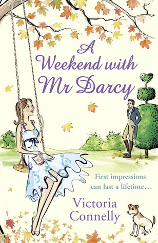
For this week's FFO, I give to you the US and UK versions of Victoria Connelly's A Weekend with Mr Darcy, which I reviewed in all its flirty cuteness in 2011's Austen event. Below you'll find both versions, which both have a strong cute factor to them, but it's up to you to decide in the comments which you would reach for, or which you would prefer on your shelves. And if you've read the book, feel free to chime in which you think suits the book more. In short, click through to vote and tell us:
Which one did it better?

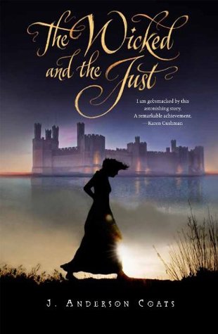 Last Week on FFO: the original and updated versions of J. Anderson Coates The Wicked and the Just went head to head, and amid the many, many effusions of love for this book that made me want to bump it to the top of my pile, I was able to come to the conclusion that the original cover is more loved (and thus, the winner), but that many of you thought the new cover my draw in more teens, and bring the book to a wider audience, thereby also making it sort of win-like.
Winner... mostly ------->
 |
| Click the pic to be taken to the Austen in August Main Page! Thanks to faestock & inadesign for the images used to create this button. |
The drawing cover. It's just too cute!
ReplyDelete+JMJ+
ReplyDeleteI also like the cover on the right. It's cute, romantic, and whimsical . . . and it has an adorable dog! =D
Both are cute but I like the one on the left best! I have the version with the cover on the left and I do think it is adorable! So I am biased. (Haven't read yet so I'm not sure which is a better descriptor) In its defense I do think there is detailing on the bottom that is hard to see but cute in person. I also like the tag line on that one better.
ReplyDeleteHaving read the book (and owning it) I have to go with the cover on the right! It sums up the cute factor just right
ReplyDeleteI love the left's fashion better, but think I prefer the right.
ReplyDeleteI like the one with the drawing better. This is another unread book I have lurking on my kindle
ReplyDeleteI prefer the cover on the right. It looks sweet. ^.^
ReplyDeleteI've read it but it's been a while and I get it confused with Austenland (I think)! Regardless I prefer the one on the right, I mean it has Mr. Darcy on it! lol
ReplyDeleteI loved the story and can see myself picking up either book for 'cute' cover. The one on the left told me right away that the book was modern, but the one on the right gave the idea of the tone of the story so...I guess no matter which side of the pond I'm from this book would get picked up and read.
ReplyDeleteTough choice, I do love both.
ReplyDeleteI vote for the left, for it seem to get to little love. :)
Oh I've always loved the US cover more! It grabs my attention and is just adorable! The book is awesome and fun for some light summer reading!
ReplyDeleteAs whimsical as the drawn cover on the right is, the juxtaposition of "Mr. Darcy" and the very modern outfit photo cover grabs my attention more. And makes me want to learn more about it.
ReplyDeleteI love the cover on the left. I think the right, while cute, misses the crucial fact that it's a modern story and that Mr. Darcy isn't actually a character. If I picked that book up, I'd be expecting something more like Me and Mr. Darcy.
ReplyDeleteI haven't read the book but I'd have to go with the cover on the right.
ReplyDeleteKnowing very little about the book, I'd have to go with the left one for something I would be more likely to check out. The right one is cute though!
ReplyDeleteHUGE Victoria Connelly fan! and book on R is the one I'm voting for - great match for VC's lite writing ;))
ReplyDeleteI'm leaning towards the cartoon one, though, they're both super cute. Also, kinda sold by that cover...
ReplyDeleteI like the 2nd one best, but I think the 2 covers give off different vibes altogether. The 1st has more of a YA feel to it, while the 2nd has more of a Chick-Lit (for 20-somethings & 30-somethings feel). So, I think a choice on this might have something to do with one's age.
ReplyDelete