

Earlier this week, the cover for the second book in Gennifer Albin's Crewel World series was released, as well as an updated cover for the paperback of book 1. And it screamed Face Off.
I have to say, I'm a little torn on this one, because although I loved how pretty the original was, it's a little delicate and precious for the story it represents. The new cover, while a much better representation of the story, IMO, manages to be a tad generic-photoshoppy, but still intriguing; it stands apart enough that I think I'd look into the books, if I didn't already know what they were about. Actually, I find the paperback of Crewel to be incredibly bland (is she wearing a Baywatch swimsuit?), but the cover for Altered builds upon it and intrigues me...
Take a look, read the synopsis below if you're so inclined, and if you're familiar with the series, feel free to factor in which you think fits best, and then let us know in the comments,
Which one did it better?
ORIGINAL

UPDATED


Enter a tangled world of secrets and intrigue where a girl is in charge of other’s destinies, but not her own.
Sixteen-year-old Adelice Lewys has always been special. When her parents discover her gift—the ability to weave the very fabric of reality—they train her to hide it. For good reason, they don’t want her to become a Spinster — one of the elite, beautiful, and deadly women who determine what people eat, where they live, how many children they have, and even when they die.
Thrust into the opulent Western Coventry, Adelice will be tried, tested and tempted as she navigates the deadly politics at play behind its walls. Now caught in a web of lies and forbidden romance, she must unravel the sinister truth behind her own unspeakable power. Her world is hanging by a thread, and Adelice, alone, can decide to save it — or destroy it.
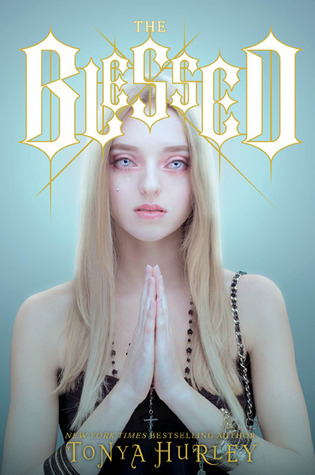 Last Week on FFO: Tonya Hurley's The Blessed faced off against its 2.0 version, which got a total overhaul in terms of cover and even title (Precious Blood). A lot of you were creeped out by the original cover (which is what I love about it - it elicits a reaction), which is why, I'm imagining, it was changed. Because of the unsettling-ness of the cover, in fact, the vote ended up split, even though you guys thought the redo was pretty generic: of 9 votes, 4 were for unsettling-but-awesome, 4 were for I-can't-look-at-that-I'll-take-anything-else, and 1 just couldn't decide! I think both are interesting, but as I said, I bought the original on creepy cover appeal, so I'm going to play tie-breaker and say
Winner ----------->
[I mean, it's reversible! Bonus points for that easily net the win.]
I'm not crazy about the first cover, too blurry, but I don't like the new covers. They scream generic YA.
ReplyDeleteI like the original cover. I do not like the new covers at all. They are so blah...
ReplyDeleteI love the original cover, the new cover doesn't do anything for me.
ReplyDeleteI don't really understand the original cover. I like the updated covers more, even though they don't look very original.
ReplyDeleteI really don't like the new covers. Book covers with faces on them is such a turn off!
ReplyDeleteFor the longest time, I didn't see the face on the original cover- just a swirl of colors. And that intrigued me about the novel. But now that I see the face, it bothers me. And the reduxed covers bother me as well (person standing over landscape is SO very overdone, especially for YA dystopian!). Maybe this is because I just finished Crewel and hated it, but I don't like either cover. I'd prefer the old one, without the face that I was apparently blind to for so long.
ReplyDeleteMe: What, there's a face in there?
ReplyDelete*goes to look*
OMG THERE'S A FACE IN THERE. I don't know how to feel about that...
To be honest, I don't like either cover but the old one is more interesting. As mentioned above the new covers are way too generic.
ReplyDeleteAs Beth said: "For the longest time, I didn't see the face on the original cover- just a swirl of colors. And that intrigued me about the novel." Then, when I started seeing the face, I was creeped-out at first. But, I got used to it. I like the cover.....
ReplyDeleteBut, since it seems that they are doing the series with the new(er) covers now, I think I would prefer the new(er) covers now, so that my books would all match.