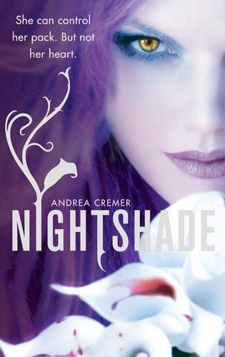
I thought the subtle changes in this one were kind of funny. Below, you'll see different versions of Andrea Cremer's Nightshade, each a slightly different version. Now, it's not unusual to see different covers for the same book (different countries use different covers to appeal to their specific market, paperbacks often get a new or tweaked cover, etc), but what's amusing here is that it's not a complete overhaul -- it was obviously deemed a pretty enough picture to keep, but
something needed to be changed to appeal to each consumer base...
So what do you think? Those of you who've read the book, which do you think fits most? For those who haven't, which makes you want to read it most?
Which did it better?
Last Week on FFO: We took a break for the new year. But the week before
that, River Boy and Things Not Seen had a ghost-off, with the moodier feel of Things Not Seen earning it a unanimous win.

Winner --->


I like the picture on the first one best, but like the writing of the middle cover.
ReplyDeleteFirst one on the left for me, too.
ReplyDeleteI like the middle one the best. The script and the slight color change give it a leg up from the first one. The one on the right looks to creepy for the story
ReplyDeleteI'm thinking similar to Ashley. I love the first cover best, but the writing is so much nicer on the second.
ReplyDeleteI love the orginial one, the first one. It's beautiful. The writing on the middle cover is too big and I do not like that thing that comes out of the I. And the last one is a bit too much! :)
ReplyDeleteFirst on left! I marveled at it whilst reading. Love that book!
ReplyDeleteBlue! I always love blue.
ReplyDeleteI like the colors of the second one best. My eye is immediately drawn to her eye and the plant coming out of the "I" pulls the viewer naturally around to the title and the rest of the cover. I think the shade of the title needs to be a little darker though because it gets lost in the lilies.
ReplyDeletethe middle one. i lean toward the purple.
ReplyDeleteBlue is actually my favorite color with purple coming in second...but I'm going to go with cover numero uno on this one!
ReplyDeleteIt's kind of hard to explain why I like it so much seeing as they're all so similar...part of it is the varying shades of lavender that I find so, well, pretty! I like the sizing and layout; I like the sharpness of the image; overall I find the first one more visually appealing!
♥Isalys
I still like the first one. But the second one's font is pretty too.
ReplyDeleteI like the middle one best. The left one's colouring makes me slightly uncomfortable.
ReplyDelete