

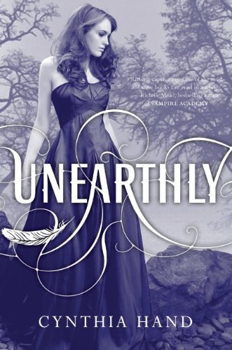
On the cover-to-cover showdown today we have 2 versions of Cynthia Hand's Unearthly. I think most of us here in the US are familiar with the cover on the left, but having just finished the book, I came across the red dress cover on Goodreads when I went to rate the book. I'm a little torn as to which I like best, as I think they are both very pretty but both have their drawbacks. I do have to say, though, that the picture of the blue cover doesn't nearly do it justice. The cover in person is shiny,with silvery letttering and a ruby glow to the background -- really lovely.
But what do you think? Which does it better?


Winnah! ----->
Love that red dress cover =)
ReplyDeleteThe cover on the right is much mroe vibrant and I love the red dress!
ReplyDeleteWe have the red dress cover here in Australia and the blue one looks insipid after seeing the alternative. Red cover all the way!
ReplyDeleteI can't decide between them. They are both gorgeous. Is the US one blue then IRL because it's always looked lilac/purple to me on my screen.
ReplyDeleteI like the blueish colored one the best.
ReplyDeleteHands down, no contest, total knock-out is number 2 with that smashing color and red dress :)
ReplyDeleteI love the US cover, the blue one. Just beautiful. :)
ReplyDeleteTSB: It's sort of a deep blue/lavendar.
ReplyDeleteI have to go with the red dress.
ReplyDeleteI'm kind of torn...I really like both of them for different reasons. Maybe after I read the book I'll be able to pick one. Love the red dress, though.
ReplyDeletei go for blue. the red makes it look vampire-ish.
ReplyDeleteTo me this isn't much of a contest - while I like the blue it seems washed out in comparison to the vibrant red which is much more striking. Thanks for the fun comparison!
ReplyDeleteOh wow -- good question! I'm really attached to the blue/purple cover for some reason because it's just so striking and seems really angelic. The red dress one does capture the essence of the fire better, I think, but I can't help but wonder why she's facing the forest fire in a gown?
ReplyDeleteHa! I never thought of that, but you're absolutely right, Casey. That is a bit on the bizarre side...
ReplyDelete