

What do you think? Which makes you want to pick the book up?
Who did it best?


Last Week on FFO: She Smells the Dead smelled defeat when it went up against Ghost Town. A lot of you did like She Smells the Dead (though not that horrific title), and some found Ghost Town chaotic, but most praised the flourishes and colors of Ghost Town. Me personally, I think GT wins hands down.
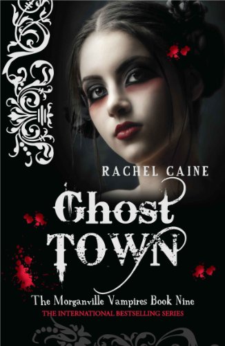 The placement of the subject is much nicer, I love the fade and the flourishes, and the angle of the model is so much more flattering. And though the cover for She Smells is nicely done for the most part, it certainly does look a bit like "fun with photoshop."
Winner ------>
Things Not Seen :) Good one! I hadn't seen these before.
ReplyDeleteTotally Things Not Seen.
ReplyDeleteAgreed!
ReplyDeleteYou know, these just kill me. If I EVER have a book published (this would of course require me actually writing one first) I would BEG the publisher to use original art...
Things not seen for me. They look like totally different books. They both have different feels to them. The right one I can identify with better. More likely I'd read that with that cover than the other one.
ReplyDelete