
The following guest post comes from Michi @ A Sweet World, who is sharing her thoughts on a whole bunch of Austen covers -- because we all do it, right?

"Never judge a book by its cover ..."
I have several editions of Ms Jane Austen's books in my collection. However, I decided to limit myself to only the most note-worthy editions.

 Publishers: Canterbury Classics
Back Cover || Endpapers
Buy: Bookdepository || Amazon
As light pink is my favourite colour, this is my favourite among my Austen Flexibounds even though it might not be my favourite Austen novel. I sincerely think hat this is the prettiest.
Just like the Pride and Prejudice version, the cover of this book also has a word cloud effect and has beautiful endpapers.
The title's font is in a gold and it looks positively pretty against its light pink background. Emma would have been proud.
 Publishers: Canterbury Classics
This continues the word cloud effect theme of this collection. However this time, the cover is a light blue with the title in light pink.
I think the font/fonts used on the cover are pretty but this may be my least favourite cover of the collection. Despite a lot of things going on on the cover, it feels the most boring to me. It is probably why this is what I bought last.
The endpapers are pretty though and is among my favourites.
 Publishers: Canterbury Classics
This is another favourite of mine and probably comes second only to the Emma edition. It continues the collection's theme, but this time the cover is in lilac and the title font's color is gold. I am beginning to notice that I am partial to gold font and I suspect that I might just be attracted to shiny things.
The endpapers are the best thing about it however. I love how the violets look like they were painted on the pages.
 Publishers: Canterbury Classics
 Publishers: Canterbury Classics
 Publishers: Barnes and Noble
Back Cover || Endpapers
Buy: Bookdepository || Amazon
This was the most difficult to find in my collection. It is unavailable or sold out in most places. In fact, I only managed to find this in a secondhand bookstore. I consider myself very lucky.
I love the Barnes and Noble Collectibles and I make it my mission to collection all the editions with my favourite authors and stories.
As I mentioned before on this post, I think I am fond of gold lettering. This edition goes the distance. It does not only have gold letterings, the decor and the pages from the side are in gold too. It is hardcover and an attached ribbon bookmark.
Its overall design feels almost like a book you would find in an old library. I love having this edition on my shelf.
 Publishers: Barnes and Noble
So in honour of Austen in August, I want to show off the most beautiful editions in my collection. Who knows, maybe someone else will like to take one of these home.
Word Cloud Classics
Pride and Prejudice

Publishers: Canterbury Classics
Published: 2012
Cover Colour: Hot Pink
Buy: Bookdepository || Amazon
The Flexibound Word Cloud Classic edition of Pride and Prejudice was one of the first purchases I made with with my first paycheck and I never regretted it.
It is not only beautiful to look at, but the feel of both the cover and the paper is good.
I especially like how it was designed. The word cloud effect on the front cover is definitely a contemporary design concept, but when you open the book and look at the pages it is very elegant and pretty. I love the contrast of old and new.
Emma

Published: 2012
Cover Colour: Light Pink
Back Cover || Endpapers
Buy: Bookdepository || Amazon
As light pink is my favourite colour, this is my favourite among my Austen Flexibounds even though it might not be my favourite Austen novel. I sincerely think hat this is the prettiest.
Just like the Pride and Prejudice version, the cover of this book also has a word cloud effect and has beautiful endpapers.
The title's font is in a gold and it looks positively pretty against its light pink background. Emma would have been proud.
Sense and Sensibility

Published: 2012
Cover Colour: Light Blue
This continues the word cloud effect theme of this collection. However this time, the cover is a light blue with the title in light pink.
I think the font/fonts used on the cover are pretty but this may be my least favourite cover of the collection. Despite a lot of things going on on the cover, it feels the most boring to me. It is probably why this is what I bought last.
The endpapers are pretty though and is among my favourites.
Northanger Abbey

Published: 2012
Cover Colour: Lilac
This is another favourite of mine and probably comes second only to the Emma edition. It continues the collection's theme, but this time the cover is in lilac and the title font's color is gold. I am beginning to notice that I am partial to gold font and I suspect that I might just be attracted to shiny things.
The endpapers are the best thing about it however. I love how the violets look like they were painted on the pages.
Persuasion

Published: 2012
Cover Colour: Blue
I do not have enough powers of persuasion to convince people to buy this edition, so I will let it speak for itself. I would say this might be the prettiest one in the collection but I do love this colour combination.
This edition has a light pink title font on a dark blue background.
This edition has a light pink title font on a dark blue background.
Mansfield Park

Published: 2012
Cover Colour: Mint
Last but not least in the flexibound editions is Mansfield Park. The cover is in mint green with the title font's colour in shiny hot pink. I love this edition too, though maybe not as much as I love the Emma edition. The colour combination of the cover and the endpapers are so light and pretty that it reminds me of spring.
Barnes and Noble Collectible Classics
Jane Austen: Seven Novels

Published: 2007
Cover Colour: Dark Green
Back Cover || Endpapers
Buy: Bookdepository || Amazon
This was the most difficult to find in my collection. It is unavailable or sold out in most places. In fact, I only managed to find this in a secondhand bookstore. I consider myself very lucky.
I love the Barnes and Noble Collectibles and I make it my mission to collection all the editions with my favourite authors and stories.
As I mentioned before on this post, I think I am fond of gold lettering. This edition goes the distance. It does not only have gold letterings, the decor and the pages from the side are in gold too. It is hardcover and an attached ribbon bookmark.
Its overall design feels almost like a book you would find in an old library. I love having this edition on my shelf.
Jane Austen: Seven Novels

Published: 2016
Cover Colour: Ice Blue
Just when I thought that I would not love an edition as much I loved the first B&N edition, along comes the 2016 Edition. I am so in love with this edition.
It is very much like the earlier version with its style, the gold pages on the side, and ribbon bookmark, but this edition gives a different feeling. This feels lighter due to its much cooler colour.
The silver letterings and decor on a cool blue background is absolutely stunning. It was love at first sight.
 Back Cover || Elizabeth || Bennett Sisters || Lizzie and Darcy || Jane and Bingley
Buy: Bookdepository || Amazon
It is very much like the earlier version with its style, the gold pages on the side, and ribbon bookmark, but this edition gives a different feeling. This feels lighter due to its much cooler colour.
The silver letterings and decor on a cool blue background is absolutely stunning. It was love at first sight.
Bonus:
Manga-Style Pride and Prejudice

Buy: Bookdepository || Amazon
While not my favourite edition or altogether pretty, I thought it would be interesting to share.
This is the Pride and Prejudice novel done with the characters/illustrations done in the Japanese manga style. Admittedly, I am not a big fan of the art but it seemed interesting enough to have in my collection. However, I don't think I will be collecting all the novels in this style since I really just bought it out of curiosity. I think I am satisfied with having it in my favourite novel.
Back Cover || Marianne and Elinor || Comic
Buy: Bookdepository || Amazon
I thought it would be interesting to talk about this too.
Who would have ever thought that Marvel would make a Sense and Sensibility comic? I certainly didn't. When I think of Marvel, I think of Thor, Iron Man or Captain America. Not that I am complaining because I love the art much more than the Pride and Prejudice one earlier.
I have not read it yet, but so far from an artistic perspective I love it. It gives me a different tone to the story. When I read the novel, I always imagined it had a lighthearted tone. This comic is not how I imagined with its more serious imagery, but I can still appreciate it for the art.
This is the Pride and Prejudice novel done with the characters/illustrations done in the Japanese manga style. Admittedly, I am not a big fan of the art but it seemed interesting enough to have in my collection. However, I don't think I will be collecting all the novels in this style since I really just bought it out of curiosity. I think I am satisfied with having it in my favourite novel.
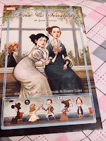
Comic Sense and Sensibility

Back Cover || Marianne and Elinor || Comic
Buy: Bookdepository || Amazon
I thought it would be interesting to talk about this too.
Who would have ever thought that Marvel would make a Sense and Sensibility comic? I certainly didn't. When I think of Marvel, I think of Thor, Iron Man or Captain America. Not that I am complaining because I love the art much more than the Pride and Prejudice one earlier.
I have not read it yet, but so far from an artistic perspective I love it. It gives me a different tone to the story. When I read the novel, I always imagined it had a lighthearted tone. This comic is not how I imagined with its more serious imagery, but I can still appreciate it for the art.
 |
| Click here to return to the master list of Austen in August posts! |
I’d never seen the Canterbury Classics covers. Gorgeous!
ReplyDeleteThe Canterbury Classics ones are particularly lovely. I have a set of Austen books in the Penguin clothbound classics range which I love.
ReplyDeleteOoh, I love the look of the Canterbury Classic covers! And that comic of Sense and Sensibility looks fun! I've never seen an Austen in comic form!
ReplyDeleteI have the comic Sense and Sensibility, but ooooh, I want the B&N one. I've got the Penguin Classic covers on my list too.
ReplyDeleteI don't know about those stiff looking covers. They are pretty though.
ReplyDeleteI have the Canterbury Classic cover Pride and Prejudice. I love the look and feel of it.
ReplyDelete