

Becky of The Flutterby Room got ahold of me on Twitter (mine | Becky's) and suggested using the cover redos for Stephanie Perkins contemporary romance series (Anna and the French Kiss, Lola and the Boy Next Door, and Isla and the Happily Ever After), and I thought that sounded like a great idea! I hadn't actually seen them, and I'm sure I'm not the only one. I know we all dread a cover-redo, especially when it comes mid-series, but this is actually a series that I thought was begging for a redo.
I mean, don't get me wrong, there are things I like about it - the font, for instance, I don't hate. Or Lola's purple hair. But for the most part, I've always found these covers generic and cheesy, and had not the least little bit of interest in reading these books (they god I was convinced otherwise by the showing-up of the book in my mailbox from Liz... (and then the 2nd, later, because she just keeps being awesome!), because these books do not deserve to be judged by their covers). But what I'm saying is, this is not a series I'd reach for solely on cover appeal. In fact, I'd assume from these covers that I already know everything there is to know, and I'd skip it, missing out on all of the greatness within. So they needed an overhaul, IMO.
Enter the new covers, which I probably would reach for, to see what they're about. They're pretty and their bold, and they have a great sense of place, and maybe adventure (in the discovering yourself sense, not the dragon-slaying sense...). The drawback? They've lost the sense of character that the others had. So, I guess it's down to which you'd rather have conveyed, character or place. (And, IYO, how cute is too cute.) So,
Which did it better?


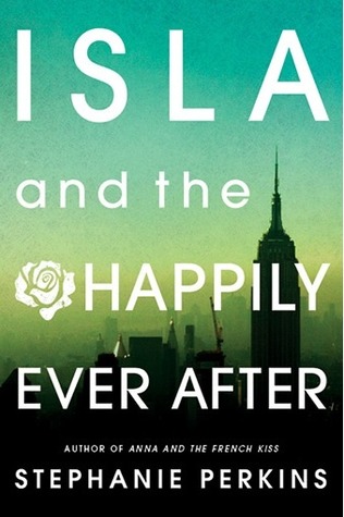
ORIGINAL
vs
UPDATED


I can't really say I like either of the Stephanie Perkins covers, but if I had to choose I would choose the updated version.
ReplyDeleteOooo I love both, but I think I liked a bit more the covers with people because they are supposed to be the main characters of the story and I liked that. Or maybe it's because I already have the books with people in the cover and the change didn't like it.
ReplyDeleteBut, anyway, my vote for the OLD covers :)
Honestly, I don't like either version. They both look generic and cliché too me. But I guess if I had to pick, the updated covers are somewhat better than the originals, not by much though.
ReplyDeleteI've never liked the old covers. I initially wanted nothing to do with ANNA because of that cover and title (it was positive reviews that led me to read it.) I much prefer the new covers.
ReplyDeletePossibly the new covers are better.
ReplyDeleteI like both sets of covers. I own the original versions so I lean toward them but the updates aren't terrible. They are a lot better than a lot of the cover updates we've seen lately.
ReplyDeleteI like the first set of covers.
ReplyDeleteOriginals.
ReplyDeleteThe new ones have no warmth.
I like the new covers better. They catch my attention more. ^^;; (I haven't read any Stephanie Perkins books...)
ReplyDeleteI definitely prefer the new covers. I was glad I had my nook for the first two books, because I would've been embarrassed of carrying them around.
ReplyDeleteI much prefer the new covers. Having a model depict the main character always puts me off as I hate being told what they look like.
ReplyDeleteOh, I love the originals. Why do they mess with a good thing? I bet I won't like the cover of Isla.
ReplyDeleteHeather
This one is hard for me. I love the first ones.. but I think the second cover will gain a bigger audience for the books.
ReplyDeleteAngie
Definitely the originals. They are cheesy but they have the cute teen romance appeal feeling that the books have. I'd pass over the new ones...
ReplyDeleteI'd totally scroll past the new covers, so I guess I'm ok with cheesy romance images.
ReplyDeleteI think the new covers really convey the international, cosmopolitan feel these books have. That's lost in the cuteness of the old covers--much as I love the cover of Anna, Lola is a complete pass for me.
ReplyDeleteI really, really love the cityscape backgrounds on all three. Paris, San Francisco, NYC--I know the city of Paris was really important in Anna, so I imagine it's the same in the rest. Highlighting the setting on the cover is a great way to draw in readers.
Plus, I love the color wash. It gives a really nice, summer vacation kind of feel to the books.
I understand why people hate cover redos, but the more I look at these, the more I think it was the right choice.
Originals hands down!
DeleteI'm generally not a big fan of people on covers, so I'll go with the new ones :)
ReplyDeleteI'm not a fan of either, the original seem too campy to me and the new ones are too blah. But if I had to pick, I'd gp with the campy ones over blah.
ReplyDelete