

With the paperback of Franny Billingsley's Chime about to be released, it appears the book is getting a makeover: gone are the dark, earthy tones and dreamy model placement of the hardback cover; in its place, a more sultry MC over an almost sprightly nature background. This is probably a Face Off better judged in person, because a picture is never going to show the embossing and the detail of the original cover, which is half of the appeal. And until I see the paperback in person, I have no way of knowing if it, in fact, has the same attention to detail. But pictures are all we have, so based on these alone, which would you reach for? Does either make you feel you need to own it, or would like to know more about what it's about?
Which one did it better?


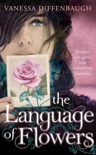
Last Week on FFO: 3 different covers of The Language of Flowers went head to head, with the 2nd and 3rd covers shutting out the first (ie the boring one I own) in a tie!
 <------ Winnahs ------>
I actually prefer the second one - I'm always attracted to anything with pretty colours!
ReplyDelete+JMJ+
ReplyDeleteAre both covers using the same model or two models who look very much alike?
I like the second cover better, although it's the more "commercial" one. Ars gratia artis covers are wonderful, too, but I'm picking a cover that combines eye-catching attractivness with functionality--which seems to me the whole point of covers. =)
Ah, I guess I'm in the minority. I like the first/hardcover cover better. I think the hand looks really... awkward(?) in the second/paperback cover. It's probably just me, though.
ReplyDeleteI prefer the original one. But honestly known neither really moves me.
ReplyDeleteI'm not going to lie, I don't really like either that much. One reason it took me so long to read Chime was the cover, but I still like the first better than the paperback. I do like the new font though.
ReplyDeleteMeh. I MUCH prefer the original. The newer one doesn't attract me at all... It's weird and... Not awesome. :P
ReplyDeleteThe first one.
ReplyDeleteI would pick it up in a book store and read the back cover, see what it was about. It looks like a much darker and creepier book.
The first cover brings to mind "magic in the streets in modern times" and the second "fairies running in the woods". I actually don't know what the book is about, so both ideas could be way off, but still!
I also think it's better design-wise. The blue of the title works well with the orange/brown of the image. The font of the title is better, too, the second one is just too busy for me.
I don't care for either particularly.
ReplyDeleteHowever, I would go with the original. I like that the girl looks like a badass.
And the second just looks weird. She kind of doesn't look like a real person at all.