

Still, I'm torn on this one. The new model more closely resembles Clarity's description, but there is just something in the old model's face - there's something slightly otherworldly and knowing in her expression, and something just a little not quite the norm, and I find it really appealing and really in line with the book. So...I don't know. I think what it comes down to for me is the really neat, artsy style of the first one, which is lessened in the new cover. I liked the not-quite-realness of the first cover, the torn paper overlay look of the hair and the birds. And I liked the lack of background detail, and loved the light reflections. But I'm happy to have my hardcover for the former cover, and I'll be happy to have the new model on my copy of Perception when it comes out. What say you? Whether you've read the book or not, which would you reach for?
Which one did it better?
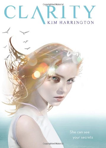

Don't forget, you can check out my review of Clarity here
and my interview with Kim here!
 Last Week on FFO: The US and UK versions of Maria V Snyder's upcoming Touch of Power went head to head, with the UK covers cool blue and lightning-hand winning easily over the softer, flowery look of the US version (and though I like both, I agree).
Winnah ----->
 |
| Click here to be taken to the Helluva Halloween Main Page! |
I actually really like them both. I think I'm a little more drawn to the red haired girl but that could just be because I have red hair :) I LOVE the cover for perception, so I'm actually not that upset about this cover redesign. usually cover redesigns make me go all stabbity with rage, but these are both really beautiful.
ReplyDeleteI already liked the old cover, I don't know why they've changed :( Now, seeing the two together I prefer the new one, but the old one is also pretty :)
ReplyDeleteAnd sidenote, I just discovered face-off friday and I LOVE this meme! I recently did a series of cover pet peeves and cover redesigns are one of them, so I love the fact that face-off friday exists. I'm going to start doing my own now, you rock!
ReplyDeleteI think I like the new one better :)
ReplyDeletei like the right with the bubbles ;-D
ReplyDeleteAt first glance I wondered if the old cover was for a comic book version, because it looks more like an illustration.
ReplyDeleteI prefer the newer cover, for a few reasons. For one, the model on the original cover looks like a child - and a ghost child, at that. 12 years old, tops. The new model looks like a young woman (she has boobs, unlike the other one), and she could pass for a 16 year old with makeup on. Her skin also has a warmer tone, and the image treatment just looks more inviting.
From a design and illustration standpoint, I still think the new cover does a better job. The details make it look less like a comic book, and the new placement of the figure and the birds balances the composition more. Having more orange tones in the image also balances out the blue and white, so the stronger hair, skin, and lip colors, along with the sky, make the blue of the water and the title pop. (Orange and blue are complementary colors, after all.) Say what you will about the models, but the new cover is a much stronger composition all around.
I do like them both. The older one looks a little edgier while the new one adds more of a softer touch with long hair and curls and more of the red hair. So...I think I'll go with the old since I just like the edgier side of stuff!
ReplyDeleteI really like them both! But the second is my fav!!!
ReplyDeleteI love the old one better. There's something about the expression on the new girls face that I just find a little off.
ReplyDeleteFor some reason I'm not that into either. But I'd choose the second one.
ReplyDeleteI like the new one better.
ReplyDeleteDefinitely the newer one. Her hair is GORGEOUS and I LOVE the way the sun is shining...most definitely the new one. :)
ReplyDeleteI like both, but the girl with the read hair looks more real. So that one, the cover at the right. :)
ReplyDeleteI would just like to vote for the paper back. The hardcover never really did anything for me. I have yet to pick it up as well. :(
ReplyDeleteMS
I totally agree that the new cover is much better. The first cover has a young girl on it who looks 12, and thus would make me think this book is geared towards a more Elementary school audience. Also, I do love the new hair.
ReplyDeleteI think i like the first one better =)
ReplyDeleteI like the old cover the most, but I like the model on the new cover better.
ReplyDeletethe one on the left though a bit pale nevertheless I like it :D
ReplyDelete