

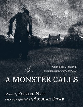
H/T to Arie Turner's instagram account for today's Face Off, because I hadn't actually seen the second version of this book until her most recent #multipleeditionMonday post. The book is Patrick Ness' award-winning A Monster Calls, a book I would have bought purely on design alone, even if I was a huge fan of Ness. Below is the US hardcover and the UK paperback. Before you decide which appeals to you, I'd recommend you take a look at this picture of the US version, so you have a better idea of the design as a whole — this book is just as gorgeous (if not more so) under the cover and throughout its pages than it is striking from cover appeal alone. But the UK version is striking in a completely differet way, and even though I find it sad that the UK version lacks the illustrations, I can definitely see why Arie felt the need to own both.
So which would you prefer to own? Which would catch your eye in the bookstore or library?
Which one did it better?


Last Week on FFO: The US and UK versions of Page Morgan's The Beautiful and the Curse went head to head, and though I like both and think they both represent the book in their own unique ways, more of you liked the vibrancy of the US version, and felt it probably represented the story better.
Winner -------->
I really REALLY like the UK cover and I was about to order it but I'm broke so I didn't.
ReplyDeleteIt's a shame it doesn't have illustrations, though!
Oh, without a doubt, the one on the left. The interior illustrations throughout are by the same artist, and really add so much depth to this story. This is one of those books that I heard about, but really wanted to have in my hands because of seeing the cover art!
ReplyDeleteI like the US version more because of the dark theme of the cover and the illustrations. The UK version is very attractive, but not as stsnd out as the US version.
ReplyDeleteI'm going with the US cover. The cover is super creepy and draws the eye more (just saw it yesterday at B&N actually). I do like how clean the UK over is but the US cover draws me in more.
ReplyDeleteThe cover on the left looks far more monstrous to me, so it's got my vote. (:
ReplyDeleteI actually own the cover on the right! It caught my eye (well, ok, the fact that it had Patrick Ness' name on the cover caught my eye), but I really like that it's a juxtaposition of the word Monster on such a pretty, innocuous background. It makes the whole concept seem subtle, instead of menacing (like the lefthand cover). So my vote is for the righthand one, though I know I'm in the minority.
ReplyDeleteDefinitely the lest (US) - it makes my skin shiver just to look at it! Haunting (and scary!)
ReplyDeleteOooo I'm thinking UK.
ReplyDelete