

I'm a big fan of Mark Haddon's The Curious Incident of the Dog in the Night-Time for a number of reasons, not least of which is the quirky, dark weirdness of the whole thing. It can be a tough book to describe to someone, because no description quite does justice to what Haddon captured with Christopher's voice and the journey Christopher leads us on.
But as much as I love this story, I'd never really looked into other versions of it. Perhaps it's because it's been so long since I read it, but probably it's because I've been content with the simple and iconic US paperback version (aka the red book), which captures just a bit of that quirky off-ness. But for whatever reason, I recently looked into other covers, and — since the book is an award winner, and all — there are many of them. What I find interesting is that, though the covers don't have too much in common, they all strive to Capture the Quirk, and for the most part, I think they succeed.
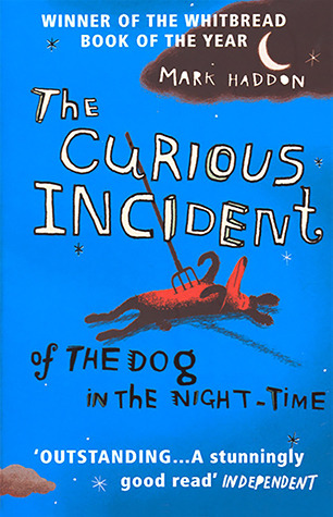
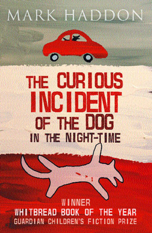
Below are 3 such covers, all of which use a fairly minimalist style mixed with a dash of the unsettling, to draw you into Christopher's world. Take a look, and then let us know in the comments which you prefer. Which would you reach for? Which unsettles you the most, or makes you the most curious? If you've read the book, which do you think best suited? In short,
Which one did it better?

 Last Week on FFO: The original and recently rebranded versions of Kendare Blake's Antigoddess went head to head, and...you guys were no help at all! It was an absolute deadlock, forcing me to play tie-breaker, which is something I generally don't do. I have things I love and things I don't about both covers, but in the end, the addition of the owls to the new cover won me over. I made an immediate connection with them because of their significance to the story, and know that if I hadn't read the book yet, the owls would have made me curious.
(I also like how they provide a bit of a stylistic tie-in to Blake's Anna series, even though they don't have anything to do with each other. Branding!)
Winner --------------->
i like the blue one the best (it's also the one that i own..) i do have to say that it's probably my favourite because that's the one i got the know the book with and jsut the one that feels right for me.
ReplyDeleteI'll have to go with the cover on the right. I think that the design and color scheme is the best for that one.
ReplyDeleteI like the middle one/blue best.
ReplyDeleteMy vote's for middle and blue. ...mostly because I just love blue, but also because it strikes me as the liveliest.
ReplyDeleteWhoa.The pitchfork straight thru the dog's chest would definitely make me pull that one off the shelf over the others. I've always seen the more generically designed first cover on shelves, so that second one is a bit shocking to see (I know nothing about the story). The third is okay, but yeah, the blue one!
ReplyDelete