

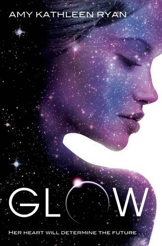
Oops, forgot to schedule this for midnight. Sorry, Face-Offers! Anywho, I really can't decide which of these I like more. It's funny: my reaction to each when I first saw them was not-quite-negative, but not head over heels, and then when I stopped to acutally look, I liked both. For the US version (left), I didn't like the simplicity until I saw it in person, and I actually quite love the view of the girl through the O/whatI'mguessingisaportholething - but is it enough? For the UK version, I initially though, Oh, another girl-face cover. But then - look at that face! The partial eclipse on the O and the effect of space overlaid on her face (which is the weirdest Seussian thing I've ever said) is absolutely stunning! But is it too much?
So what about you? Which one catches your attention, and does your impression of either change when you look at them more closely (click them to see them in more detail). Either make you want to pick up the book?
Which one did it better?

Last Week on FFO: Two covers that I personally love went Medusa -head-to-head, and though it was close, and though the author of one dropped by and let us know that the cover for hers wasn't final, it was A Beautiful Evil that (rightly) took the win. For me, though I love the vivid green snake on Shifting, it was too abrupt a change - it should have been faded into the hair more and sort of transitioned into a snake. ABE's snake was deliciously subtle, and the overall styling made for a more finished feel.

Winnah ----->
I'm going to have to go with the UK cover. The US cover is just a little too plain for my taste. The space-face thing looks cool.
ReplyDeleteI prefer the US version. It's simple but I love the centered layout!!
ReplyDeleteDefinitely the UK. More mysterious.
ReplyDeleteHmmm, the US cover reminds me of the Matched cover. The UK cover kind of freaks me out, but in a cool way. I think I'm gonna have to go with the UK one!
ReplyDeleteThe US one reminded me at first glance soo much of Scott's "Legend" and Henson's "Labyrinth" that by rights I should like it more, but at closer inspection this (what is it anyway, a glowing bull’s-eye?) thing with the photo cut-out - very kitschy, sorry.
ReplyDeleteAs a cover I prefer the twilight-vamp / across the stars (http://darkfaerietales.com/wp-content/uploads/Across-the-Universe.jpg) feel of the UK version.
glow with the sparkle! yeah!
ReplyDeleteinteresting to note with last week's cover, i feel the winner gives off an old/hag-like character while the other with the green hint is more YA.
I have a copy with the US cover, which I like. But I think I like the UK one more.
ReplyDeleteUK UK UK!!!!
ReplyDeleteThey both look so pretty, but the UK cover looks a lot like Across the Universe. ;) If I had to choose it would be the US cover. :)
ReplyDeleteWithout reading the book or really knowing what it's about, the UK version would catch my eye more and make me pick it up.
ReplyDeleteBoth are nice in their own ways. I think I like the originality of the US version more though.
ReplyDeleteI need to check out the Medusa book though. Sounds cool. She never gets enough good credit.
I still like the US cover. It's simpler and not too overwhelming.
ReplyDeleteI'm definitely gonna go with the US version. I like the simplicity, but it does evoke more of a "what has traumatized this girl" kind of feeling. The UK version looks too much like Across the Universe which I really did not care for. Though, it still is flashy!
ReplyDeleteI prefer the US version. I do like the UK version, but I'm not a big fan of faces on covers.
ReplyDeleteDo I have to pick one? I love both of them!
ReplyDeleteIf I HAD to pick, I think I'd go with the U.S. version. The current trend seems to be faces on covers, and I think the U.S. cover stands out more because it's VERY unique.
I don't like the UK cover. The font looks like the show Heroes. And it's just so Across the Universe.
ReplyDelete