

So I was buying mass amounts of books the other day... This seems to be the way a lot of our FFOs are starting lately. Hmm, imagine that. Anyway, I was happily buying books, and debating whether to get a good-condition hardcover of a book with the original cover, or to get a less-than-perfect paperback with the new cover style, which would match the sequel, which I was also buying, because apparently I have no impulse control. Make sense? Of course, as with all cover redos, I was torn - do I go with format consistency, or cover consistency? Can't have it both ways. In the end, I went with the cover I liked best, though I'm not going to tell you which that is, as I don't want to bias you — which brings me to this week's Face Off: Tessa Gratton's Blood Magic!
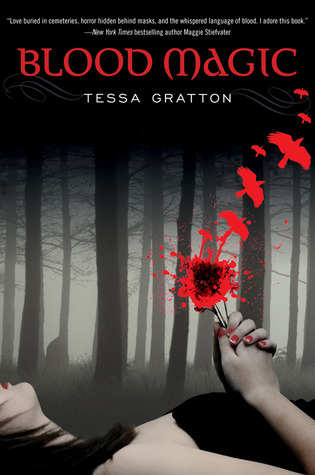
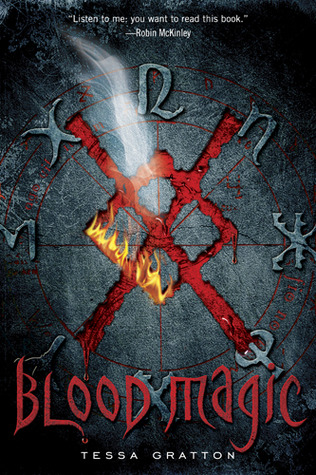
I thought I'd already done a Face Off of the hardcover and paperback versions of Blood Magic, but I was wrong, though I see why I'd think that. Turns out, I had done a previous FFO featuring Blood Magic, but it wasn't against 2 versions of itself; no, it was a battle between two books using the same stock photo (which, hey, may be why they decided to change the cover style in the first place...). Long story short, check out the two covers below and tell me which appeals to you more. Which would you rather have on your shelves? Which would you reach for at the bookstore, to see what it was about?
Which one did it better?
PS. You'll have to keep an eye out for my next book haul to see which cover won me over.
PPS. There are more covers for Blood Magic that I think may pop up in future FFOs... One pairing I'm especially curious to get your thoughts on. =D
 Last Week on FFO: We took a look at the US and German covers of Josin McQuein's Arclight, with many of you praising the moodiness and textures on the German cover. It was the clear winner, though to be fair, the US cover does not show to advantage on a computer screen — I and some of you voting all agreed that it's really a cover you need to see in person to get the full effect, and I highly suggest that if you do see it in the wild, you pick it up and play with it.
Winner -------------->
I'm going with Cover #1 on this. It's much more active, and has a lovely blood spatter affect (and crows!), it makes me feel like there's a lot of symbolism in the cover, and therefore in the story.
ReplyDeleteWhile I very much like the contrasting splash of color of the red birds against the gray woodsy background in the first cover, I think Cover #2 appeals to me more overall. (...which I almost half-attributed to the fact that I'd noted Robin McKinley's name on the top, but then I made out Maggie Stiefvater's name on the first, so... After we let all that awesomeness battle to cancel each other out as far as influencing factors, I think I'm still going with Cover #2.)
ReplyDeleteThe one on the right is much cooler if you ask me. I love the symbols. Plus, it's more gender neutral, which I appreciate.
ReplyDeleteI vote for the first one. It's more feminine and I like that.
ReplyDeleteTough choice! #1 is absolutely gorgeous in a gothic way. That red spatter against the shades of gray is brilliant. But I do like the darkly arcane elements of #2, the flames and smoke giving an energetic touch to the runes/symbols. So, I'm going with #2. I might add that if you took away the title off of these covers, it seems you'd have two very different books.
ReplyDelete