

Renee Ahdieh's The Wrath and the Dawn has been all over the blogosphere for some time now, and has been high on my list of to-gets for a roughly equal amount of time -- and that is due in no small part to the cover. Cliched admonitions aside, I absolutely do judge a book by its cover, and you do too. That is why we're all gathered here today, after all...
 With the sequel, The Rose and the Dagger, set to come out soon, TWATD has been all over my instagram feed (again), because the paperback has just been released -- along with a cover change-up. The lovely red Moroccan-ish overlay has been dropped to reveal the model beneath, along with a bumped up font (and the most gorgeous ampersand!). Now, as far as I can tell, this is a paperback-only change; the hardcover of TRATD appears to follow the style of the the first book's hardcover, and I would imagine that means the paperback version will then follow suit and ditch the overlay in favor of a model-centric cover, too. (At least, the only versions shown on Goodreads give this impression, as there is no "updated" model cover replacing the traditional cover.)
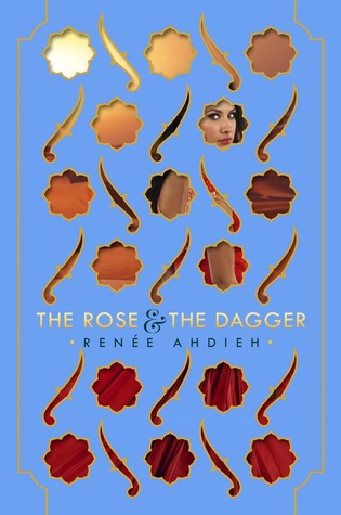
And frankly, I'm all for having version-specific changes: it allows the book to target different audiences while still allowing those of us who are anal to have matching sets (and those of us who are shallow, shallow book-cover-judgers to choose the set we find prettiest).
But the question still remains, which do we prefer. Which would you reach for, and/or which style would you most want to have a completed set of? Which one draws you in?
Which one did it better?
(And do you like the idea of consistent -- but different -- versions of the same book?


Hardcover on the left, Paperback on the right
Let me know your thoughts in the comments! And if you're curious about the results of our last FFO, not a lot of you weighed in (you should! my bad for forgetting to tweet it out...), but the UK version of Laini Taylor's Strange the Dreamer managed to pull out a win (though as Beth pointed out, it's a little Silence of the Lambs-y). I think it's really going to come down to what they look like in person, though, because I have a feeling that gilt-stamped US version is going to be a STUNNER in person.
(You can still go check it out and give your opinion, FYI. I'm really curious about people's impressions of this one.)
I think the hardcover is much prettier--plus I like that once you open the hardcover, you can see the image of the girl inside the book. It's like a cooler version of hide-n-seek! I'm sure the paperback will be pretty in person but my vote's with the hardcover :)
ReplyDeleteOff to see Laini's book covers...
OK, I haven't read it but I greatly prefer the red cover. It's so different, and visually striking, and I love that it gives a 3D impression of the women behind a screen. The paperback just looks like every other pretty-girl-YA cover. Plus, I prefer arrestingly colorful covers.
ReplyDeleteThis is coming from a gal who doesn't collect or keep the books she reads, though, so take it with a grain of salt. :)
I like the imagery of a woman behind the screen to match the storyline so hardcover is my choice. But, that aside, I love how they are doing a little something different with the paperback copy and are planning to stay consistent with HB and PB copies for future.
ReplyDeleteI MUCH prefer the paperback copy. So much so in fact that, if I'd known that's the direction they were going to go with the paperback, I would have waited to buy the book. While the tie in with the woman behind the screen is a nice idea to fitting the story (I'd guess, I haven't actually read it yet) with my vision problems, staring at the cutaways for any length of time - or like, you know, pretty much at all - makes me feel queasy. That being said, I also think the model is gorgeous and I think the culture - and the fact that the story/cover isn't whitewashed - would appeal to certain groups and demographics. Something that you really can't see/guess at with the original cover.
ReplyDeleteI love the hard cover. It is so beautiful.
ReplyDelete