Two weeks ago, Friday Face Off made its 2016 debut with the cover shakeup for Marie Rutkoski's The Winner's Curse series, in which I mentioned that the updated covers reminded me quite a bit of another female-centric YA fantasy series... This week, I thought we'd have a little Winner's Curse FFO redux, and put it head to head with said fantasy series -- Sarah J. Maas' Throne of Glass books.
From the tonal color themes to the specific Fierce Female Poses™, right down to the billowing hood placed just so, there's no denying these covers have a lot in common. When I first noticed the strong similarities, I was a little. . . surprised, to say the least, that such similar covers (especially when the originals, Throne of Glass, make up a pretty damn well-known and popular series, so it's not like it'd go unnoticed...). But the longer the comparison sits with me, and now, seeing them side by side (well, top to bottom, but you know), I think it may have been a good move. I mean, the similarities and feeling of familiarity may draw in readers from the Throne series, and as far as execution, I think they may have even done it better... There's something so crisp and clear in the design that makes the Throne of Glass series almost look muddied. . .
But I'm curious to see what you think. Which do you find more appealing? If you had to pick between the two sets, which would you reach for on the shelves? And maybe the real question is, if you've read the books, which suits their respective story more? In short,
Which one did it better?
VS.
(And in case you were wondering, in our last Face Off, the original covers for The Winner's Curse series just b a r e l y managed to eke out a win. Many of you noted the submissiveness of the original covers not quite fitting Kestrel, but though the overall vibe of the original designs better captured the romance and feel of the books.)


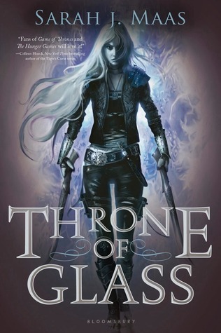
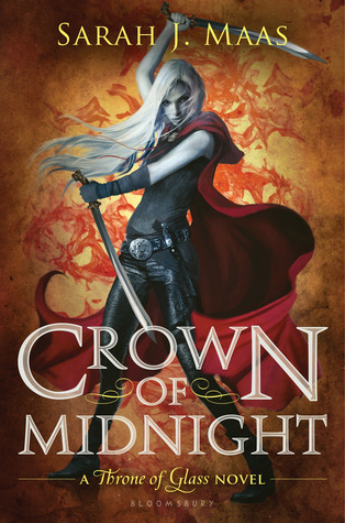
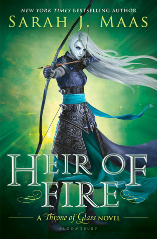
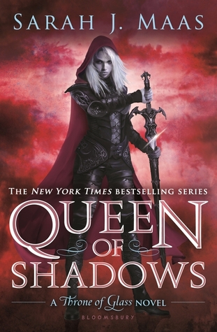
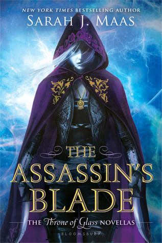
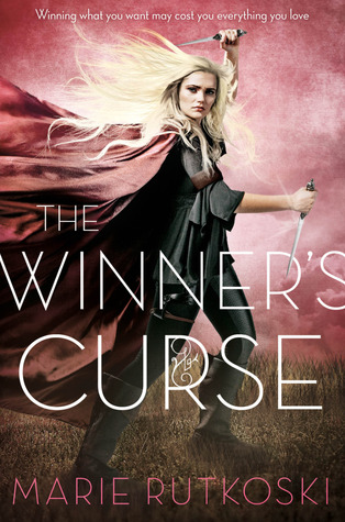
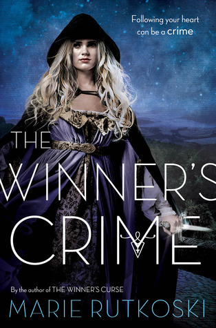

Although I prefer the clean typography of The Winner's Curse series, I always tend to go for illustrated covers over photography (there's more of a chance that a photo looks cheesy), so Throne of Glass is my choice!
ReplyDeleteYes, I VERY much prefer the WC type. It's simple, but you're right, it's clean and clear, and the Throne series just looks fussy when it's on an already busy background.
DeleteMy vote goes to Throne of Glass. I often prefer illustrations to live models, largely because they're less limiting; feels like there's a better chance a drawing will actually look like the character it's meant to portray, as opposed to just "some general pretty person". It vexes me no end when the cover and the character description don't match up!
ReplyDeleteIf this featured the original Winner Trilogy covers, it would be impossible for me to choose. I don't hate the new ones, but I think I'm harboring a little resentment they were going to scrap that beautiful red dress cover. I would be pick Throne of Glass in this case because the front and back illustrations are gorgeous.
ReplyDeleteHaha! I totally get book resentment. ;)
DeleteDefinitely the *Throne of Glass* series. I love the manga artbook feel those covers have to them.
ReplyDeleteThrone of Glass, the drawn character just looks badass.
ReplyDeleteThe model in the photos not so much, she doesn't have that grrrl attitude, she looks, well, like she's pouting.