
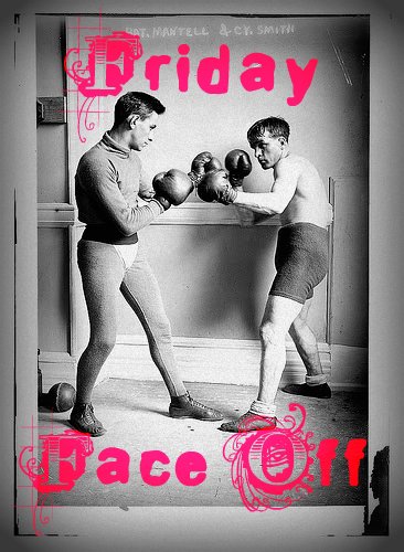
Welp. It has been a looong time since we've had a Friday Face Off, and I know, I know, I've been promising to bring it back for ages, only to have it pop up for a week here or there, and then: nothing. And hey, that may happen again, I make no promises, but FOR NOW. . .
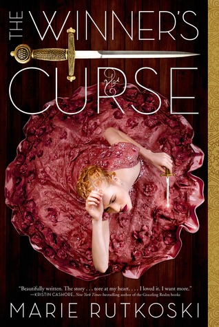
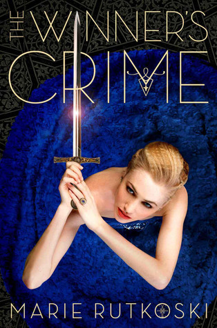
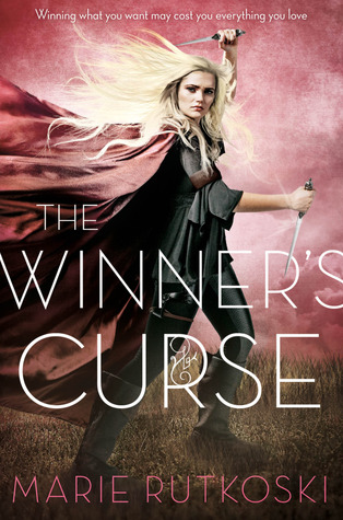
A startling cover change crossed my laptop a couple of weeks ago, and at first, I thought it had to be a mistake. It's for the The Winner's Curse trilogy, and it's not that the new covers are horrendous (they're not, I actually like them), and it's not that they look quite similar to another popular fantasy series (they do, they really do, but still... I like them). It's just that. . . I don't know why a change was even needed? I mean, that's often the case, hence the many, many FFOs we've had full of lamentations that things can't just stay the same (or that series' can't at least just be freaking finished first, so that we don't have mismatched covers, dammit!). But for this series -- I just don't get it. The original covers are striking, and as a series theme, they held their own and were instantly recognizable. And I thought the series was doing well, which would mean that the normal reason for a change (to boost sales) wouldn't apply, though I guess I may have been wrong? The new covers do project more of a sense of strength than the originals, which can be read as very defeated. . . And with all the splashes of color, the new versions might be considered more dynamic, and have a leg up over the understated elegance of the originals, for some readers.
(And to be clear, the series had already undergone a minor overhaul between the publication of the first hardcover and its paperback version/the rest of the series... so basically, with this change, each release will have brought with it a facelift.)
Either way, I like both sets of covers, but I'm definitely curious to see what you guys think! Take a look at both sets below, and then let me know in the comments which cover YOU prefer. Which would you reach for on the shelves? Which stands out to you more? If you've read it, which do you think suits the story best? In short,
Which one did it better?

VS.
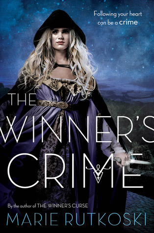

Duke it out for your pick in the comments!
I definitely prefer the new covers over the older ones. Mostly because she looks more like a warrior and I like that physical look. (And, honestly, I;ve never been a fan of fancy dresses.) I also like the colors more from the new ones. But, I've heard from several people that the new covers don't fit the series AT ALL. So, I'm definitely curious to see if that's true because I'm planning on starting this series soon.
ReplyDeleteI think maybe some blending of the two would fit the story better, but honestly, she SHOULD look more like a warrior.
DeleteI prefer the original covers because I feel that they fit the story better BUT the new covers for the paperbacks will be a nicer visual for new readers I think.
ReplyDeletei love the original ones it looks prettier especially in hardcovers *heart eyes*
ReplyDeleteIn the third of the new ones she looks like Dany from Game of Thrones...
ReplyDeleteI believe the original covers are much better.... More striking and attractive to the eye...however I do like the new winner's crime cover as well
ReplyDeleteThe original covers are much better. They capture the romance and angst of the books. The new ones give a witch vibe to me and aren't very representative of the story.
ReplyDeleteThere is definitely more of the angst in the originals. But I like the strength and fearlessness of the new ones. I wish they'd found away to merge the vibes of both, because then I think they'd nail it.
DeleteI have the original ones, but if given a choice, I prefer the bottom ones. Action over posing will always be my preference
ReplyDeleteAgreed!
DeleteI've not read the series but I'd be more likely to pick up the second set. The model in the first set looks submissive as if the things in the story are just happening to her whereas in the second she looks like a cool action heroine. She seems like a stronger protagonist.
ReplyDeleteThat is the one thing that I don't feel fits the books -- the model does look far too submissive for Kestrel. I think otherwise, it suits it well, but the on-the-floor, looking up almost pleadingly -thing just doesn't suit.
DeleteWow, that's quite a similarity to the other fantasy series (do I dare call it an almost carbon copy :)).
ReplyDeletePersonally I like the old covers better anyway - and I really, really liked the first design - I think the idea of giving her a longer weapon on each further title adds a fun Freudian subtitle.
Makes me wonder, will there be a fourth book? Will she get to wield a Zweihänder at some point?