

Earlier today, when I was gathering links for the books mentioned in this month's Book Chat on covers, I noticed a cover switch-up for one of the books I talked about today, Rachel Hartman's (glorious, amazing) Seraphina. Three things happened: 1) I realized this would make a good Face Off; 2) I realized that I hadn't posted today's Face Off, because it is, in fact, Friday; and 3) I became a bit puzzled, because according to Goodreads this version doesn't exist (it does).
We've actually had Seraphina on Face Off before, when the US (below) went up against the UK version (where the US won in a landslide,
Which one did it better?


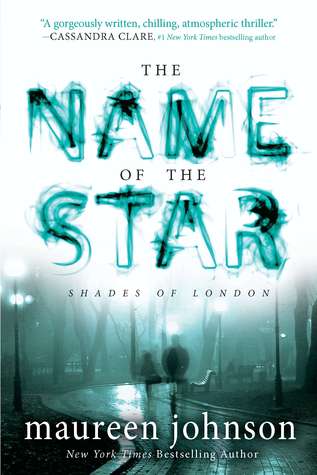 Last Week on FFO: The cover redesign for Maureen Johnson's The Name of the Star was up for debate, and voting was pretty split. Some of you found the new cover too muted and boring, and the font obnoxious, and some of you found the old cover to be cheesy, too photoshopped, and not an accurate representation of the book. In the end, though, there can only be one winner, and the redesign just barely - just barely - managed a win.
WINNER -------------->
Gah...I actually really like the dull covers of the original, but I am loving the new font, which may mean that the new one edges out for the win in my book.
ReplyDeleteO I like the purple!
ReplyDeleteI have to say I love the new one! There's just something about it that pops more and draws my attention. And I LOVE purple! I also love the new font! It just screams dragons :)
ReplyDeleteI really love them both. It seems like the two designs are going for two different moods, so honestly, I'd have to read the book before I made a final call.
ReplyDeleteThe new one really does POP! :) But I have to admit that I still like the old one best. I just read this one last week and it was fabulous! :D
ReplyDeleteI like the font of the new one but the old version is lovely :)
ReplyDeleteOverall, I prefer the older version, but I like the font on the newer one a lot.
ReplyDeleteRed. Red red red red red red red.
ReplyDeleteHmm, the blue is eye-catching, but I prefer the original by a long way!
ReplyDeleteTo me, the original just seems to fit the time setting of the story more, and really feels 'dragony'. I think the purple/blue makes it look much more like a children's story, which it really isn't. I don't think it needs the added colour to be an individual, stand-out cover.
~Ailsa
I'm gonna have to say the old one. The purple just doesn't do the story justice. Though, I do love the new font. But the old cover continues to stand out to me.
ReplyDeleteBoth versions are fantastic! I do like the new purple version best though. The color and text change really works for me.
ReplyDeleteI like the old one best though I haven't read it yet. I have the old one and I look at it and it's just beautiful. The new one looks too new.
ReplyDeleteHeather
I agree with the general consensus. I prefer the old cover by far, but I do like the font on the new cover.
ReplyDeletePica @ Pica Reads
I like the old one better. The new one is pretty, and I think the color scheme is more stereotypical of fantasy covers. From what I've heard, though, it seems like the old cover captures the feel of the book better. Guess I'll have to read it and find out.
ReplyDeleteI love the font on the new one, especially the diagonal line it has to match the dragon, but I prefer the old cover over all.
ReplyDeleteEw I really do not like the new one! Maybe because I already have read and fallen in love with the book (and the original cover), but I feel like the original is much more fitting and I also still prefer the original font.
ReplyDeleteI love the original one. The coloring makes it more subtle, but it's just perfect that way. I feel like the new one is a weird art experiment in opposing colors or something. The purple sky is not flattering with the green dragon. When I first saw this, it made me so very, very grateful that I own the hardcover already.
ReplyDeleteI love the purple, the design of the title is so much better. The color makes everything standout. I like the old but if they have the new in hard cover I will be buying a copy.
ReplyDeleteI love the colour in the new cover. If this was the original I probably would have picked it up already. Definitely the new version for this face-off.
ReplyDeleteI'm loving the simple browns with the red border
ReplyDeleteI'm loving the simple browns with the red border
ReplyDeletei prefer the original. i think it fits better with what i imagine the time period to be. the purple and green are too obviously "dragon" colors.
ReplyDeletefishgirl 182 @ nite lite book reviews
I like the old one... But I like the new one too. For me, I think it's a tie.
ReplyDeleteLook what you did, Misty! I have the red but I want the purple. I WANT IT. But then again, the red one is signed but still. The purple has a pretty font. Sigh. Purple gets my vote.
ReplyDeleteI love both of them, but I have to go with the new purple version. It is more striking and amps up what is so great about the original cover.
ReplyDeleteHi! I think i like more the Uk version!!
ReplyDeletePurple is my favorite color, so I'm automatically biased. But then, the woodcut looks more classic on the brick red... but purple...
ReplyDeleteIn the end, the new font tips it. It looks more draconian to my eye.
And yes, I do need to read this book. Sigh. Along with about fifty bazillion more...
Purple is my favorite color so it should be an easy choice, but side by side I still prefer the old cover.
ReplyDelete