

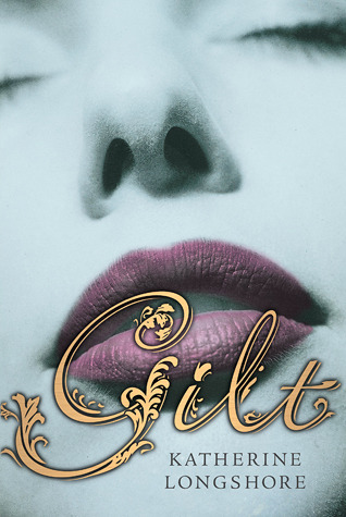
The paperback edition of Katherine Longshore's historical intrigue debut, Gilt, will be coming out next May, so the cover was recently released, and the only thing to stay the same is the font! The the two covers are completely different, I think they actually work together in a really interesting way - they could almost be two different angles of the same scene. But even though they can give much the same impression, that doesn't mean they always will, and I'm sure there are those of you who wouldn't bat an eye at picking up one, but would never reach for the other. So the question is, which? Which one would you reach for, which would grab your attention and make you curious about the story inside?
Which one did it better?

 Last Week on FFO: The hardcover and paperback editions of Jessica Spotswood's Born Wicked went head to head, and though feedback for both was mostly positive, with the votes being nearly split, the original, earthy version managed to snag a win.
Winner --------->
To begin: a rant.
ReplyDeleteHow on EARTH were the votes on Born Wicked's cover nearly split? The new one is AWFUL. It's so bubblegum pink and ABC Family original movie looking. COME ON, people. I wanted everyone to hate it so we could be like Penguin, get your act together. UGH!
As for this week's, I don't love either, but I think the hardback is a bit more unique, despite the fact that you can see up her nose. The paperback is trying a bit too hard to be The Tudors.
Sorry Christina. I was one that voted for the new one. ;)
ReplyDeleteThis week I'm digging the couple cover. Sexy in a good way.
Hahaha! Christina, you crack me up. And you're right, I hadn't noticed, but it DOES look very ABC Family...
ReplyDeleteAs for this week's, I agree about not loving seeing up her nose (and that the other looks like The Tudors), but it is a very striking image nonetheless, which is why it gets my vote, too.
I love the couple one! The one of just her face doesn't look like anything... The new one catches my eye and makes me want to know about the two of them. I really like it!
ReplyDeleteI'm also torn...I see both of these covers and think historical romance and bodice-ripping...
ReplyDeleteHow do you make the crazy history of Henry the VIII about teens....hmmm?? So I'm intrigued for just see how it's pulled off.
But the couples one gets my vote. It's steamy and like steamy!
I feel like the new cover looks way to much like a bodice ripper and not much like a YA it's a bit too steamy. The second cover is very Tudors and I really like the hardcover a bit better.
ReplyDeleteIm not keen on either - but if pushed I would choose the couples cover :)
ReplyDeleteNo way in HELL would I ever willingly pick up a book with couples (in progression to the horizontal dance) on the cover.
ReplyDeleteI don't like the original cover either, but I'm going with that one. I wouldn't be against reading it in public, at least.