

I just recently bought a copy of Kim Harrington's The Dead and Buried, and while I was shopping, I couldn't decide which of 2 versions I wanted to get. On the one hand, I generally prefer hardcovers (which is a big change from a few years ago, when I pretty much hated hardcovers...); on the other hand, another cover kept popping up in paperback, which I hadn't seen before (still not sure if it's the ARC cover or an int'l edition...). I like both, don't get me wrong — I love the use of light in both, and I love the clarity of the hardcover, and the dark mystery of the paperback. But I couldn't seem to decide between the two of them. (In the end, I went with the copy in better condition, as it was from a used book site; don't remember which won, but I think it was the hc.)
My inability to choose between the two meant I had to have it on FFO - and when I saw a 3rd version - the UK edition - with a completely different cover and title, I knew this week's bout would be an interesting one.
So take a look at all three versions below, hard/soft/UK, and let me know which you would reach for on the shelves. Which appeals to you more? Which would you rather have, which would you rather read in public, etc. In short,
Which one did it better?


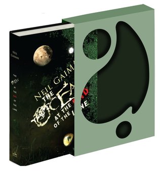
Last Time on FFO: It's been a good long while since our last Face Off, due to life and things, so as a refresher: the original US and the deluxe version of Neil Gaiman's The Ocean at the End of the Lane went head to head. Both covers had fans, but in the end, the deluxe version and its awesome slipcover managed to snag the win.
Winner -------->
I love the UK one. The silhouette in green is so pretty and the use of bokeh particles just makes the photographer in me happy.
ReplyDeleteI vote for the cover in the middle. The body lying on the carpet freaks me out; the UK cover is very pretty but I think it's not creepy enough.
ReplyDeleteI like the UK title but the middle cover art. I'm not a fan of "dead" cover folk, especially when we already get the whole death concept in the title. But the word "killing" makes it seem more active and visceral, and thus engaging. And the backlighted stairs girl almost gives me a little vertigo, which is cool. Yay for new perspective!
ReplyDeleteI think my vote goes to the UK cover this round. It doesn't seem the most fitting what with all the sparkles, and I like the US title better, but based on art style alone I like it miles better than the other two.
ReplyDeleteHmm... The figure on the left cover gives us plenty of "dead", but not enough "buried".
ReplyDeleteThe cover on the right is very pretty. A bit /too/ pretty, for either of the titles' implied subject matter.
For the best blend of pleasurable aesthetics and creepy factor, I cast my vote for the cover in the center.
The middle one, no question.
ReplyDeletePersonally, I like the UK cover. But, I wonder if the reason they changed the title is because they knew the cover didn't fit the original title. So, for the original title, I like the HB cover best.
ReplyDeleteI think the UK cover is by far the best. I think the first one is boring and the second one is okay. But I like the US title better.
ReplyDeleteThe UK one definitely did it best - hands down. It's beautiful and mysterious. Love it.
ReplyDeleteDefinitely the one in the middle. I think it's the most attractive, intriguing, and original!
ReplyDeleteHmm, I'm going to go with the middle one. I think it matches most with the first sentence from the Amazon description: "A haunted house, a buried mystery, and a very angry ghost make this one unforgettable thriller." This cover has a house, someone going downstairs (to evoke "buried"), and it looks like a mystery/ghost story.
ReplyDeleteThe UK cover is pretty, but too pretty for me to think about it as a haunted house story. And I'm sort of over the first cover because of so many dead girls on covers: http://trac-changes.blogspot.fi/2011/10/cover-trends-in-ya-fiction-why.html