

Hey! Long time, no Face Off! But I stumbled across something that was just begging for an FFO, so we're back! A few days ago, HarperTeen released a ton of covers for their upcoming 2017 release lineup (more on that to come), and among the pretty shinies was a brand new cover style for Heather Demetrios' Dark Caravan Cycle -- or at least, the cover change was new to me. I've been a little out of the loop, so who knows, this could be old news to you. Either way, we're talking about it today.
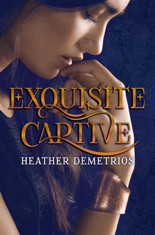
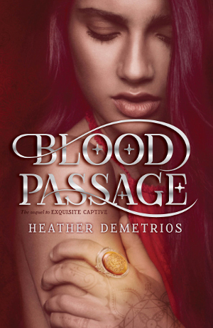
Below you'll find the original covers for the first two books of the series (top), and the simplified new covers for all three books (bottom). As you can see, they've shifted away from the sort of personal, etheral, slightly haunted look of the originals, into a more streamlined, iconic style for the redesign. My thoughts on the change is at the bottom of this post, But before you let me bias you one way or the other, take a look at the two sets of covers below. Which would you reach for on the shelves? Which would pique your curiousity? Which would you rather own, personally? If you've read the stories, which do you feel suits the series most?
Which one did it better?
VS.


As for me, when I saw the redesign for the 3rd book, I was actually quite taken with it. I like the original cover for Exquisite Captive (I'm a sucker for purple and dreamy), but when I saw the redesign, I though, Hmmm, now this is something I could really get behind. The strong stance and simple iconography of it are powerful and impactful, and that big, glorious swoop on the ess in "Slave" just does things to me (I'm even more a sucker for good type than I am for dreamy purples), so I was on board -- until I saw the other two covers in the redesign. They're okay, even if the icon for Blood Passage reminds me of James Bond . . . but they're nothing to write home about, and the patterning takes away from the sleek simplicity.
So I'm torn on this one, but with the 3rd one, at least, I feel like they really got some things right.
(It should be noted, though, that they're replacing a cover with a visible POC with something more generic, which is a little disappointing. Though of course, generic means readers more readily insert themselves in the story, which helps a book sale, so I get it.)
Have a suggestion for an upcoming Friday Face Off? Let me know in the comments or email me here!
I find neither terribly appealing, but the lower ones do not look quite as cheap to me.
ReplyDeleteI didn't realize there was a redesign and at first I groaned, but then I really looked at the cutaway scenes of each of the new ones. I guess it's not bad, but I still like the older ones best.
ReplyDeleteI love fonts as much as the next geek, but the redesign looks very cheesy romance cover to me. I would have no clue, looking at it, that it was a contemporary fantasy whose main character is not white. And even though the stance of the cover model on the original first book reminds me of Dior perfume ads, at least it tells me something about this book. Freedom's Slave is the first one in the redesigned cover series that does that at all. So I gotta say the first covers. Although I think they could've done a mix of the two concepts to even greater success.
ReplyDelete