

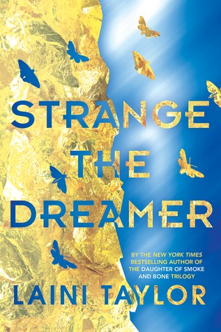
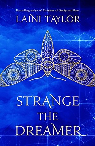
Finally! Finally, I have nothing going on on a Friday, and it is time for the next Friday Face Off. And it's kind of perfect time, actually, because just yesterday, the covers for Laini Taylor's Strange the Dreamer were revealed, and oh boy, they are gorge.
Below you'll find the US and UK versions of the book, respectively (ie US = left, UK = right). Both have a similar theme (blue, moths), but both approach it very differently. And I gotta say, I'm kinda smitten with both. But what about you? Which book would grab your eye in the bookstore? Which would you rather display on your own shelves? For you,
Which one does it better?
ABOUT THE BOOK:
Get It Here | Add To Goodreads
Strange the Dreamer is the story of:
the aftermath of a war between gods and men
a mysterious city stripped of its name
a mythic hero with blood on his hands
a young librarian with a singular dream
a girl every bit as perilous as she is imperiled
alchemy and blood candy, nightmares and godspawn, moths and monsters, friendship and treachery, love and carnage.
Welcome to Weep.
(And if you're curious about the results of our last FFO, Throne of Glass won in a landslide.)
They are both gorgeous and eye catching. I'm not familiar with the book- not even the blurb so it's fun to form an impression with just cover alone.
ReplyDeleteIt's interesting how both can use blue and the dragonfly, but give me a whole different idea about the book inside. The right one draws my eye to the negative use of space and gives me more of a sci-fi scientific feel while the left one is softened and opens up the possibility of contemporary.
So, I'd like either.
For me, the more vivid blue one is far more eye-catching, so that's my winner. There is nothing wrong with the blue and yellow one, but it wouldn't entice me to pick it up and read the blurb. Which one is the US and which is the UK?
ReplyDeleteRight one (UK?).
ReplyDeleteWhile there's something to the conceptual approach in the left, I feel the execution doesn't really deliver and just makes teh novel look cheap.
The filgrane design of the moth on the right however is a sure eye catcher. Maybe a bit to new agey looking to capture my interest, but sure nicer on the eye.
The left! Which is odd, because usually I'm all for the UK version. But in this case, despite the pretty colors, it echoes the cover of Silence of the Lambs a little too much for me.
ReplyDeleteThey're both eye-catching and at first glance, the UK cover caught my eye because THAT BLUE BACKGROUND THO. It's gorgeous...plus the font is prettier *o* But I'm not a fan of the moth so if I had to choose between which edition I'd buy for my personal collection, I'd go with the US cover.
ReplyDelete