

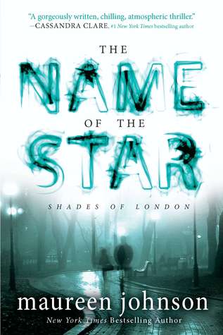
I'm sure you guys may have noticed that Maureen Johnson's Shades of London series (ie The Name of the Star, etc), have been revamped. The second book, The Madness Underneath, is about to be released, and gone is the lurking Jack the Ripper, Victorian ghost story-ish feel. There is still some misty* ghostiness, but otherwise, the covers have very little in common. Of course, we all hate when a series changes covers midstream (now they'll never match, dammit!), but all the same - anyone a fan of the new versions? Check both out below and let me know in the comments what you think. Which one would catch your eye?
Which one did it better?

Last Week on FFO: The Us and UK versions of Leila Rasheed's Cinders & Sapphires (or Secrets & Sapphires, depending) went head to head, whisper to whisper, in what was a much closer match than I'd anticipated. But in the end, Cinders conveyed the time period better, and pulled off the win.

Well, I have another version of it, which stars a weird looking girl (with all that hair) on the cover. But, I prefer the one on the left side of the page. I like that hat! So Victorian era! = )
ReplyDeleteVampirella of VampirellaninGuncesi.
I much prefer the newer, revamped cover. It's more mysterious (and I think looks better overall).
ReplyDeleteI would pick up the first...love the shadowy figure in the background...conveys more of the story than the newer one I feel.
ReplyDeleteI like the first but once I listened to the book, I knew it wasn't an accurate portrayal of the story. I vote for the blueish cover.
ReplyDeleteThe new cover appeals most :)
ReplyDeleteI'm much more fond of the new cover (on the right)... has a bit more of a mystery feel going on and I love the effects on the title. The old cover seems strange and that strange apparition floating behind is odd (and why is she lying on the ground anyways?)
ReplyDeleteI like the original, but prefer the new - less gray, more action.
ReplyDeleteI like the new cover more.
ReplyDeleteI like the new cover since it doesn't look so photoshopped but the font of the new one is atrocious i wish they pick a better font
ReplyDeleteI definitely prefer the original cover. The new cover is so blah.
ReplyDeleteI go for the one which has a man and a woman in the cover. That cover makes me curious to know what the book is about and think I want to read it. The other one leaves me indifferent :(
ReplyDeleteI prefer the first cover. I don't like the second one at all. The original ghosty feel is ultimately much cooler.
ReplyDeleteI like both, but I prefer the re-vamped cover.
ReplyDeleteI strongly prefer the new covers for this series. They're more creepy, and don't give out a false vibe about what the book actually is (because I know I'm not the only one who went in thinking it was a historical).
ReplyDeleteI love the new covers. So BRIGHT and eye-catching! I don't really know much about the book but that cover would definitely make me pick it up.
ReplyDeleteI think the redesign is boring, but the original cover looks like a poorly done self-pub, so the redesign wins.
ReplyDeleteWow I think this is the first time I prefer the remake
ReplyDelete